Watson
Discovery
ROLE
Visual Designer
ABOUT
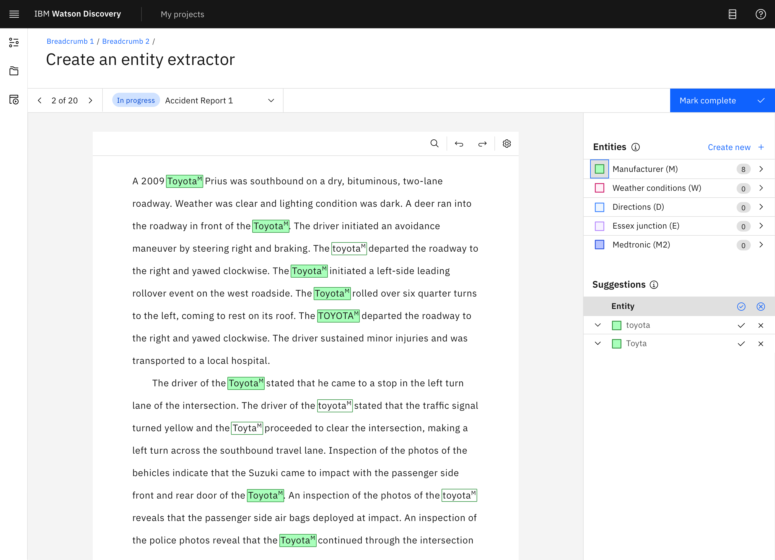
IBM Watson Discovery is an AI platform that applies natural language processing to extract insights from unstructured text.
I designed the layout and workflow for the annotation system, developed accessibility-focused UI components based on IBM’s Carbon Design System, and built interactive prototypes to communicate interaction patterns and user flows. I also collaborated closely with the accessibility team to ensure usability standards and contributed to a successful beta release in November 2021.